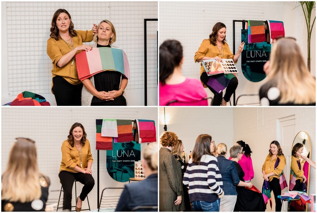
In March this year we had an in-person meet-up event for my membership community SHINE, and one of our amazing members Claire Gorman gave a presentation on how to discover your signature clothing colours (based on features such as hair colour, eye colour, and skin tone). It was such an eye-opening presentation for everyone that came, and we could’ve listened to Claire all night long! In all honesty it was supposed to be a 30 minute talk but I think we were still engrossed in colours and Claire two hours in… Luckily the bar and grazing table was well stocked ?
Claire shared how wearing the right colours can benefit you in business, as colours can convey energy, emotion, and send a message about who you are. Wearing colours that look amazing on you can also make you feel good and increase your confidence – something that definitely comes in handy today when we are all under pressure to show up for our customers and audience regularly, whether it be in-person, over zoom, or on socials.
The colours we wear aren’t the only colours that are important though – the colours you use across all elements of your brand are important. And here’s why…
Colour psychology
Colour affects us quite deeply, as our brains are designed to respond to colour in different ways. This all happens subconsciously most of the time and can often by influenced by our culture or upbringing.
Colour psychology is the science behind how colour makes us think and feel. It looks at the relationship colours have to human behaviour.
Multiple studies have proven that there is a really significant relationship between brand colour and customer reaction. In fact, some studies show that initial judgments about a brand or product are made based on colour alone.
Your brand colours have the ability to impact your brand performance, and repetition of the same colour can strengthen brand awareness, or memorability.
Therefore, it’s essential to put a lot of thought into selecting your brand’s colour pallette, as it can influence so many things!

What is ‘colour theory’ and how does it affect your visual brand?
How much thought did you put into the colours in your logo? Did you think about what ‘vibe’ you wanted to portray when you designed your website or branding? Or how you wanted your audience to ‘feel’?
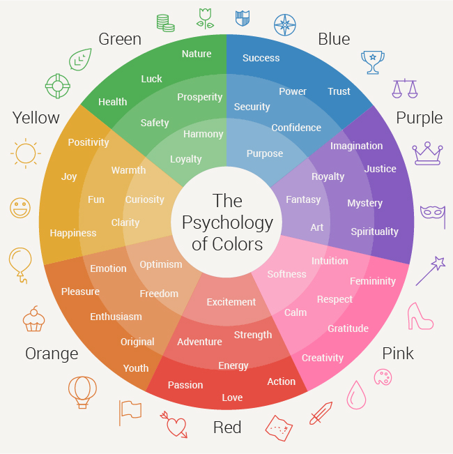
In their basic form, there are 4 colour palettes:
Red = Physical
Evokes feelings of strength, warmth, energy, stimulation, masculinity, excitement, as well as defiance and aggression.
Blue = Intellectual
Evokes feelings of intelligence, communication, trust, efficiency, serenity, duty, logic, coolness, reflection, calm, as well as aloofness.
Yellow = Emotional
Evokes feelings of optimism, confidence, self-esteem, extraversion, emotional strength, friendliness, creativity, as well as fear, depression, and anxiety.
Green = Balance
Evokes feelings of harmony, balance, refreshment, rest, restoration, reassurance, environmental awareness, peace, as well as boredom.
There are then all the in-betweens. The blends of colours. The hues, tints and shades. The way the colours are paired with words, images, and symbols.
Yes, it’s true your brand logo might be made up of words, symbols, images, and colours. But the colour element of your branding will evoke emotion more than any other element.
For example, red is the iconic colour used for brands like Coca Cola. The colour red tends to encourage appetite, hence why brands like Coca Cola use it often in their branding. They also use words like happiness in their branding, so they use the colour red to build excitement.
Another clever colour strategy is the use of blue within tech brands like Facebook, Twitter and Skype. Blue often evokes stability, harmony, peace, calm and trust, which is why some retailers add their guarantee, trust certification or free shipping icons in a blue colour to strengthen the trust aspect.
If you’ve never thought of this stuff before it seems amazing hey? But it’s true! And it doesn’t just apply to big brands or products – for small business and personal brands, the colours you use are JUST as important.
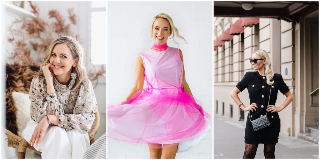
My top 5 tips on choosing your brand colours
When you think about the fact that you will be using the same colour palette across all of your brand’s marketing materials and touch points, you can quickly see how a colour’s effect can be utilised throughout any and every aspect of your business to impact your customers, employees, and wider audience!
Of course, when it comes to selecting colours, the choices can be overwhelming. Personally, I’ve had too many occasions where I’ve jumped on Pinterest to play with colour palettes, only to end up down a rabbit hole, looking at combinations that were waaay off from where I started, or where I should be… ?
If you don’t want to end up down the rabbit hole, confused and totally overwhelmed, I have 5 tips to make it much easier when choosing your brand colours:
- Think about your brand message, personality and tone of voice, then select your colour palette based on the emotions and feelings most associated with those colours.
- Really put yourself into the minds of your target audience. Even if it means choosing a colour you are not usually drawn to. Having said that, you do still need to be comfortable with the colours chosen.
- Consider how the colours fit into your industry and know your competitors’ brand colours. Are your colours too similar to a competitor? Or are they going to set you apart in the best way?
- Pick your primary colour, then work other colours in.
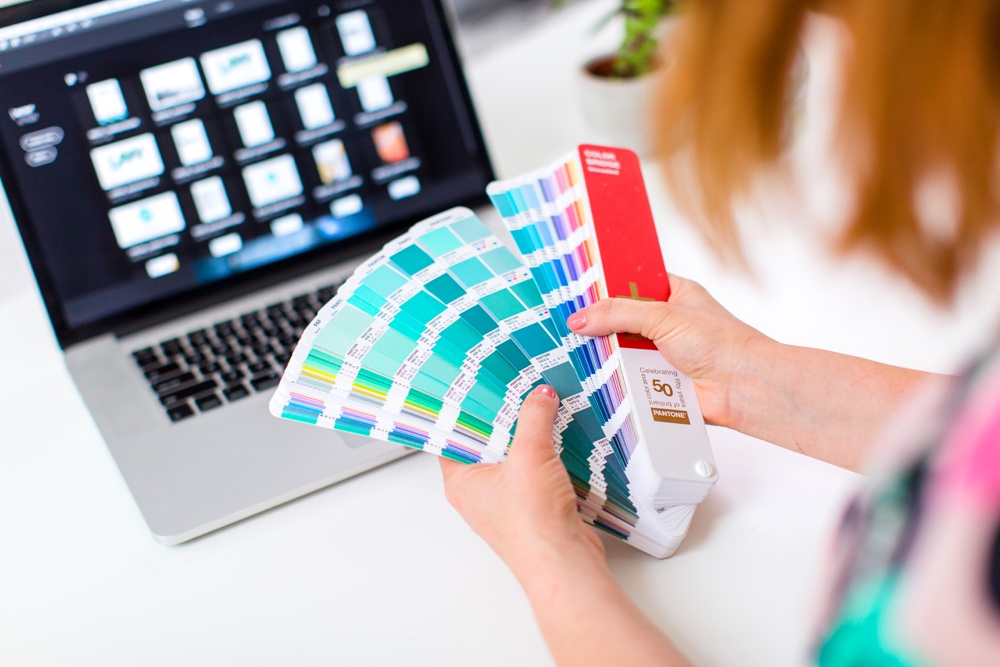
- Make sure you know the RGB or CMYK numbers for to keep future branding on point!
So there you have it. The colours in your business and how you use them play an important role in how your audience perceives you, how you can make them feel, and the memorability of your brand.
I’d love to know – what colours are in your brand palette and how did you choose them? Was it an easy process, and do they feel aligned with your message, your energy, and your audience?
—————————————————————————————————-
Would you love some amazing imagery that’s aligned with your message and purpose, and attracts your ideal audience? Get in touch and let’s chat about what we could create for you.
If you’d love to build a powerful brand, be more visible and show up more consistently online, check out my monthly membership where I’m helping driven women in business do just that.
You can also connect with me online on Facebook, Instagram and LinkedIn. And make sure you sign up for my newsletter if you’d like to get my updates and have content like this hit your inbox regularly.
[…] colour psychology and visual brandinghow to choose a location that matches your brand5 reasons to update your brand imagesNow Trending: […]